A Web Design Agency that Delivers Results
TheeDigital builds and maintains high-performing lead generation websites for ambitious businesses to beat their competition.
Have an Average Website? Get an Online Lead Generation Machine!
Award-Winning Website Design That Get Real Results
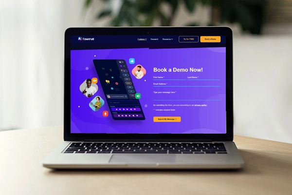
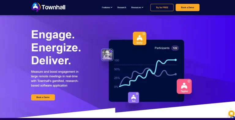
Website Development for Townhall.pro SaaS
Townhall had a limited, one-page website built when they came to TheeDigital. TheeDigital worked with the Townhall team to identify what pages they needed, where more content was needed, how to get connections set up to their external systems, and started in on the custom design process.
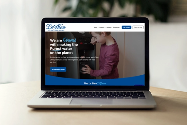
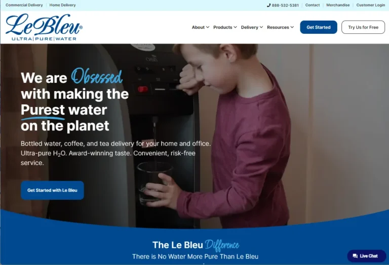
Custom Design, WordPress Development and SEO for Le Bleu Enterprises
See the dramatic transformation of the Le Bleu Ultra Pure Water website with their new custom-designed WordPress website.
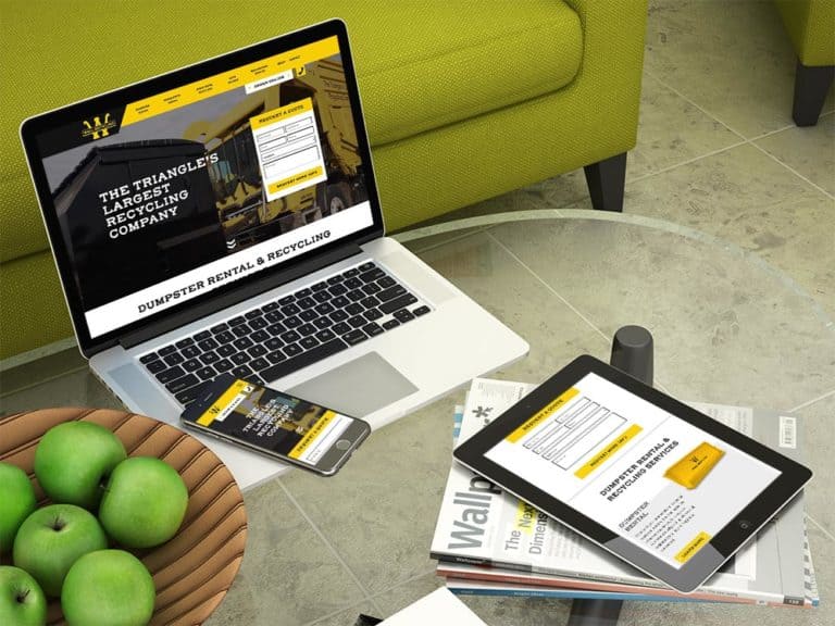
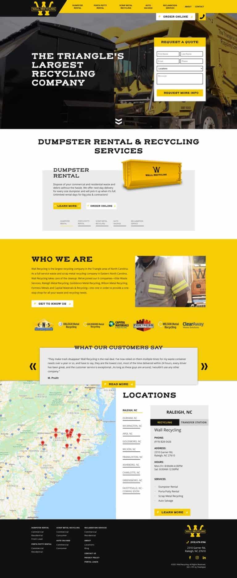
SEO and Digital Marketing for a Waste Management Company
See how TheeDigital used quality marketing and technical SEO to increase conversions and search visibility for this waste management company!
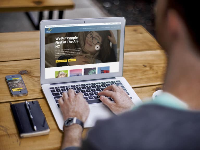
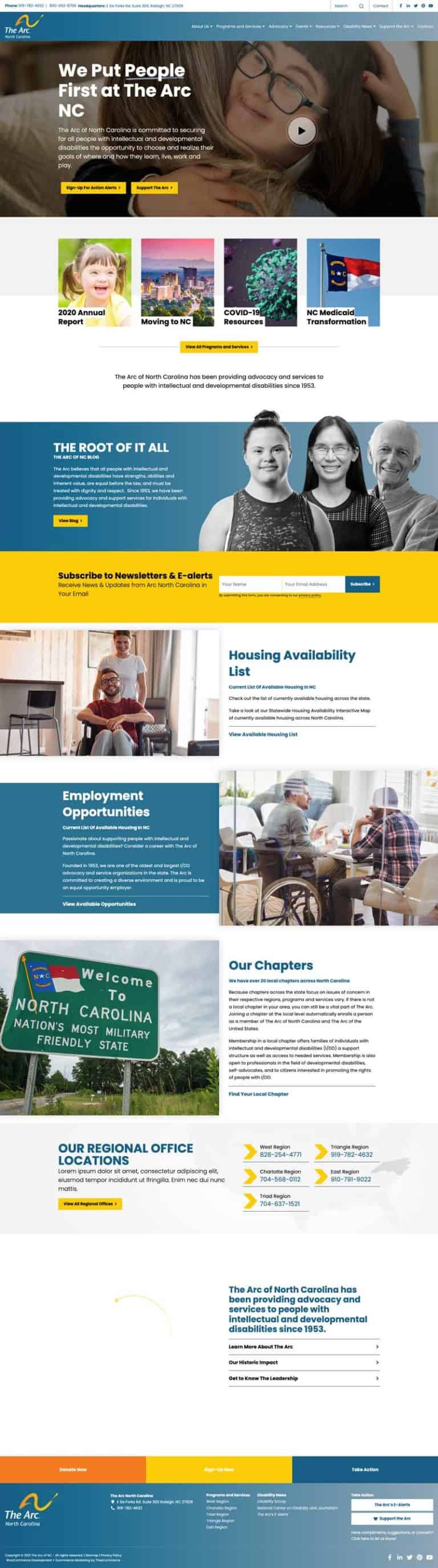
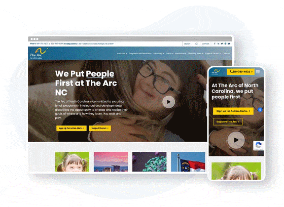
Custom Web Design and SEO for a Non-Profit Agency in North Carolina
The Arc of NC needed an ADA-compliant website that could quickly connect users with life-changing resources. See the impact that a website redesign can have!
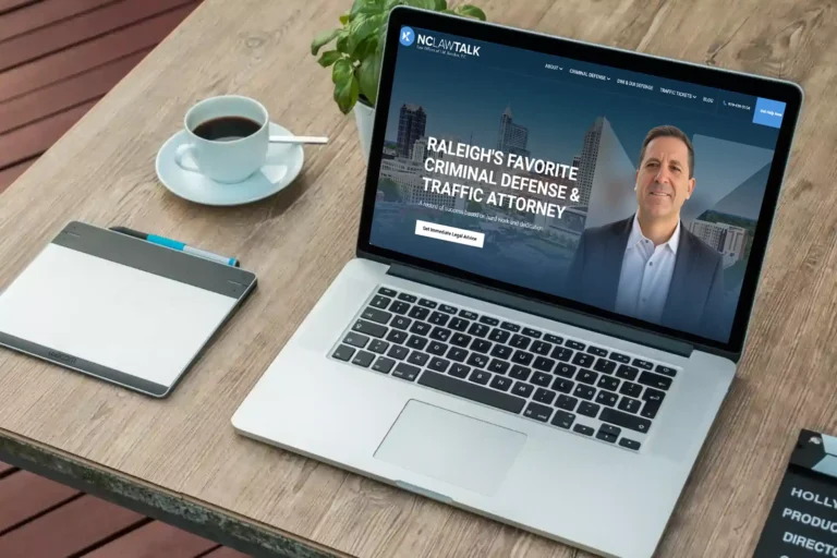
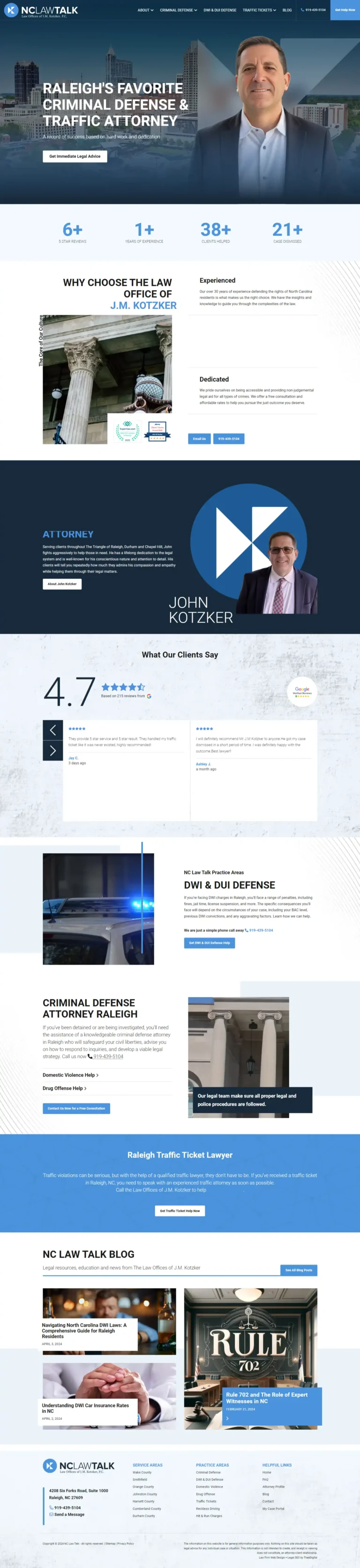
Search Engine Optimization for a Raleigh Criminal Defense Attorney
The lack of strategic keyword optimization and compelling content meant that J.M. Kotzker’s services were not reaching the right audience. Recognizing these obstacles, TheeDigital swiftly stepped in to address these marketing issues head-on and transform J.M. Kotzker’s online presence into a powerhouse in the legal industry.
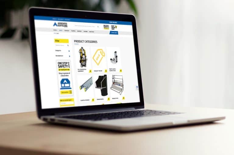
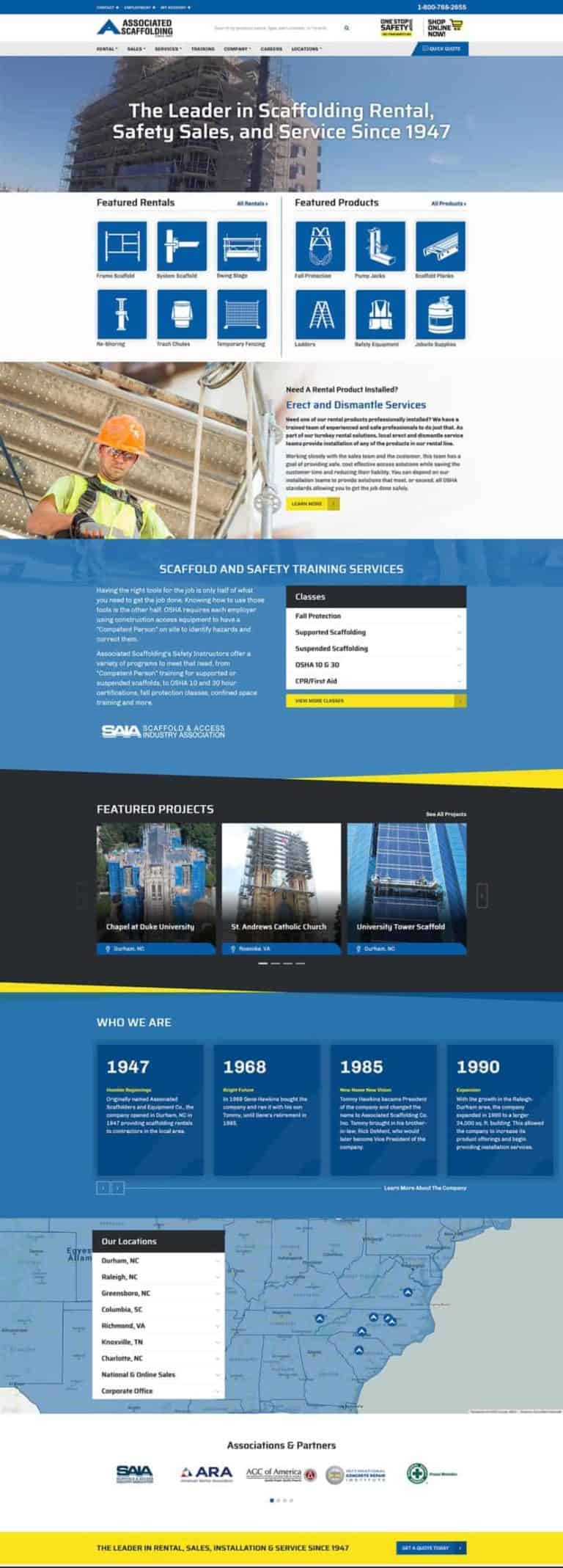
Website Redesign & SEO for a Construction Safety Equipment Company
Associated Scaffolding needed a well-organized ecommerce website to showcase and sell their products. Check out how our web design agency delivered!
Our Web Designers Offer a Full Design and Development Service
TheeDigital is a full service web design agency, providing website design and web development services to businesses.
Our Favorite Web Content Management Systems
We make the web easy for you. So, you don’t need to hire another developer again.

Our Proven Web Design & Development Process
What Our Happy Web Design Clients Say
We worked with TheeDigital on a corporate website redesign and were impressed by the team’s ability to quickly transform our ideas into a beautiful, functional website. As changes came up throughout the development process, they were flexible and found ways to deliver on those changes without increasing the scope. If you have a solid idea of the website you want, TheeDigital is a great partner to build it.

Claire Puncer
Marketing and Communications Manager
Institute for Defense and Business
How Can a Search Engine Optimized Website Help Grow Your Business?
Want to Have a High Ranking Website?
Hire our award-winning web design and web development agency to build your search engine friendly web presence!
Connect Your Website with Your Sales & Marketing Tools
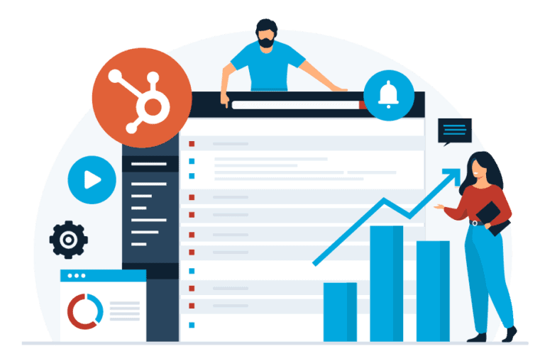
Why Is it Important to Integrate a CRM and Marketing Tool to Your New Website?
Automate and streamline your lead management process
Want to Stay Ahead of Your Competition?
Hire our safe and ethical SEO team to tame the web for you!
User Testing and Conversion Optimization
Good web design does more than look good, it also provides a great user experience. A good user experience (UX) can dramatically improve the results of your website, leading to more revenue and loyal clients.
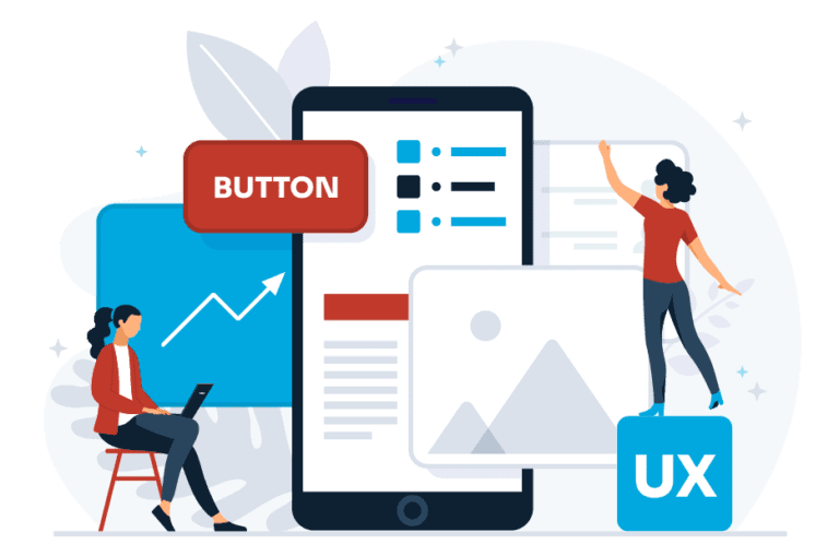
What Makes Good UX?
Addressing UX Issues
With tools like Google Analytics and HotJar, we can see how visitors are actually using your website and where they’re exiting. This lets us understand where there might be an issue with the UX and get to work fixing the issue. It also lets us know what’s working well so we can create more of what your customers want.
Want to Learn about WordPress?
Join any of our free monthly WordPress Admin training.
How a Great Website Impacts Everything?
TheeDigital Is More than Just Web Design
We Build Online Lead Generation Machines with the Right Supporting Sales Tools
Your website can be a powerful marketing tool. Using modern design trends, easy-to-use navigation, and clear messaging, your website will positively impact your ROI and overall business strategy. TheeDigital designs and develops websites that are tailored to your exact goals and target audience.
We Can Build a Safe and Secure Website for You
No more worries about website security, ADA compliance or any other web standards. Our web development firm can provide your business a worry-free web presence. So, you can focus on your business.
We Build Websites That Don’t Discriminate Against Users Because of a Disability
Our web development agency builds accessible websites for anyone regardless of their disabilities according to the latest ADA, Americans with Disabilities Act rules and regulations. So, you can be a good citizen servicing people that others don’t and expand your market share.
We Build Search Engine Friendly Websites to Outperform Your Competition
We don’t only build good looking websites we also put a big emphasis on organic search engine optimization to rank your website for your most important keywords that best describe your products and services.
We Build Mobile First Websites with Enhanced Small Screen Experience
We browse differently on smaller screens than on a standard size monitor or laptop.
We make sure the mobile version of your website is thumb-friendly to serve your visitors with easy access to the “hamburger menu” to discover your website and convenient “click to call” buttons to convert them into paying customers.
We Build Easy to Manage Websites for Quick and Seamless Content Updates
Our websites are not difficult to use. We make sure to utilize the easiest but most powerful content management systems to make the web easy for you.
We Don’t Just Develop a Great Website for You. We are There for Ongoing Maintenance and Updates
We can provide hosting, with daily backups, and ongoing maintenance plans to keep your website secure and bringing in leads.
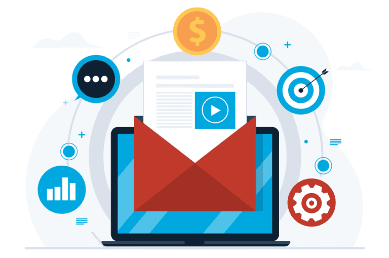
We Build Marketing Ready Websites with the Right Content to Attract the Right Leads for Your Sales Team
We research your target audience, industry, and unique selling points to compose the content that best describes and position your business to attract not just average leads but the best prospects who are the right fit and ready to hire you.
We Build Captivating Landing Pages with High Conversion in Mind
It’s our standard practice to NOT send visitors to the home page but rather to drive traffic to the pages that best serve your visitors needs and drive conversions.
This makes it easy for your prospects to find what they were looking for and convert them at a higher rate.
We Automate Your Lead Capturing and Distribution Process to Save You Time and Improve Your Sales Team’s Closing Rate
We can enter your leads into an online customer relationship management tool automatically. Whether they came from a web form, phone call, social media, event, or anywhere else. It will avoid time consuming, manual entries, and ensure your team won’t overlook any sales opportunities.
We Make Your Post Lead Generation and Nurturing Process Easier with Smart CRMs
Probably not everyone is ready to purchase your products or services but you want to make sure to keep them informed about your business during the entire sales process.
Our professional web design company utilize the best and easiest to use CRM and marketing automation tools to get most out of your leads.
We Support You in Your Digital Transformation Process to Become a Paperless Organization
Whether you just want to digitize quoting and contracting processes or connect your website with various third party business management tools, we are here to support you in your paperless revolution.
We Prepare Your Business for Fast Growth and Serve You as Your Remote Marketing Department
Our lead generation experts can build you a comprehensive online ecosystem to generate, manage and serve a larger number of customers without hiring, training and managing a large inhouse marketing team.
So, you can focus on the things that you do best, serving and growing your customers; while we do the same for your business.
We Make Your Sales Team Love You and Get You to Love Our Digital Team
The dream of any sales person is to make the leads come to them instead of chasing them. It’s something that we do every day, all day long, and can do it for your business as well. Give us a call at 919-341-8901 to discuss how we can grow your business with a well oiled online lead generation machine.


Want a Better Performing Website to Beat the Competition?
Call 919-341-8901 or fill out our form below to get a free site audit and consultation. By one of the best web design agencies in the Triangle.
Fields marked with an asterisk (*) are required.
Your information is collected for the sole purpose of providing services described on this website.
Your private information is held in strict confidence. We will never release, share or sell your information to any other entities. We hate spam too!